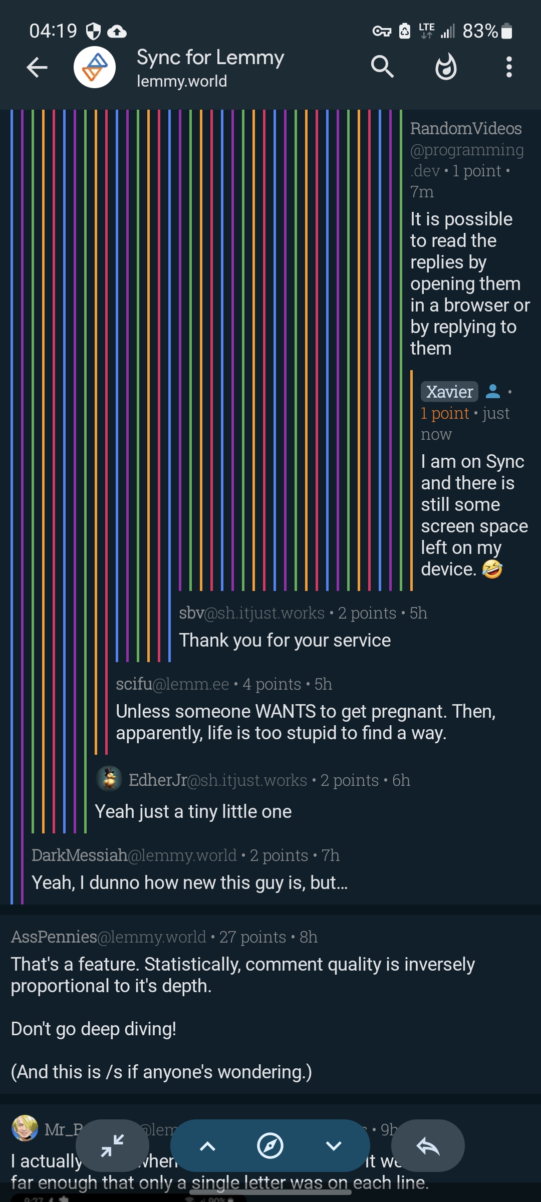
VBB@lemmy.world to Voyager@lemmy.worldEnglish · 11 months agoWhat do you think about left nest lines going through all replies?lemmy.worldimagemessage-square5fedilinkarrow-up126arrow-down17file-text
arrow-up119arrow-down1imageWhat do you think about left nest lines going through all replies?lemmy.worldVBB@lemmy.world to Voyager@lemmy.worldEnglish · 11 months agomessage-square5fedilinkfile-text
minus-squareBloody Harry@feddit.delinkfedilinkEnglisharrow-up12·edit-211 months agoyeah, way too noisy for the eyes, and it doesn’t really add any information
minus-squareVBB@lemmy.worldOPlinkfedilinkEnglisharrow-up2·11 months agoAfter 1.22 update these lines aren’t going to cover half of the screen. Do you think it still would look noisy? I like how in code editors nest lines visually indicate nest depth, but lines aren’t colorful there.


yeah, way too noisy for the eyes, and it doesn’t really add any information
After 1.22 update these lines aren’t going to cover half of the screen. Do you think it still would look noisy? I like how in code editors nest lines visually indicate nest depth, but lines aren’t colorful there.