

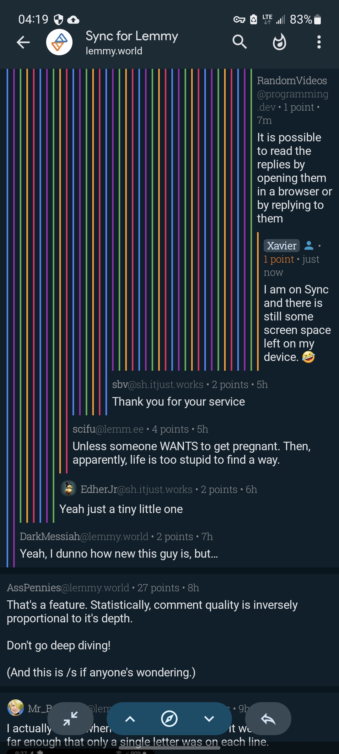
I prefer them to current look.
Screenshot taken from comments to posts testing max nest depth.
You must log in or register to comment.
Honestly I don’t really like the way that looks
yeah, way too noisy for the eyes, and it doesn’t really add any information
After 1.22 update these lines aren’t going to cover half of the screen. Do you think it still would look noisy? I like how in code editors nest lines visually indicate nest depth, but lines aren’t colorful there.
That would be great. Sometimes the short lines are confusing. It would actually work with lines all the same color then.
Reddit showed it was a bad idea