White to black, because people say that white and black aren’t colours.
But I just say “FFFFFFuck y000000u!”
They’re not hues, but they are colors, which is a combination of hue, saturation, and brightness.
my fav color is clear, so my fav gradient would be opacity
I was going for something similar with 75% opaque at the top and 0% opaque at the bottom, known as a neutral density gradient in photography, often used in landscape photographs to balance the bright sky against the less bright ground or water. This is a great one for me since I’m color blind.

This is actually my diagonal monitor background
…can you post your monitor setup?
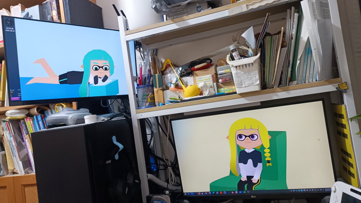
That’s not the kind of diagonal I expected. I thought it would be something like this:

Let me guess – Java developer?
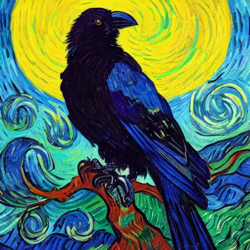
These look like Splatoon characters

Dunno if it counts as one or three gradients, but I really like this green/brown/gold gradations.
That reminds me of swimming in rivers in the forest, the sand looks golden like that through the water
Yeah, it’s mostly a “nature” gradient. Besides the sand the golden part also gets close to fallen leaves.
I used this gradient a lot of times when making websites in the past (before CSS was a thing, to give you an idea on how long it was), as it’s colourful without being flashy.
The background of all my devices is a gradient version of the bisexual flag, so I guess that’d be my fav gradient!
Teal to orange
The colors that appear in the sky during a sunset. Beautiful blues, purples and oranges, slowly dimming until it disappears over the horizon.

I mean yes, because that, but also it’s just pretty.
‘videogame ice effect’
I seriously love the over-the-top ice shaders used in all those early 2000s games. Ice always looked amazing, just this super bright white with pearlescent whitish-blue highlights that shimmered at odd angles and stuff. It’s so cool.
Like the bridge tunnel in IceFields from HaloPC in 2003.
Or the almost-fully-transparent ice tunnel in Crysis Warhead (and firefall. Firefall had AMAZING ice shaders, it had some direction-based visual stuff going on where it had volumetric speckles all throuought the foot-thick ice).
Honestly: ice-themed anything looks cool to me, color-wise
Damn. Good answer
Greyscale.
I’m colorblind.
Tint, tone and shade FTW
Cividis. Perceptually uniform gradient colormaps are fun for the whole family
Ultraviolet to gamma-ray gradient, with a polkadot pattern overlay.
Heck, I’m just a fan of the electromagnetic spectrum in general!
that fade from blue to purple
I got kind of sick of it for a while, because it was the latest clashy combo used by tech marketing, but it is legitimately pretty soothing
I wonder if orange+red is next
oh, interesting - yeah, I try not to let the marketing dominate my associations, but tbh it’s impossible to control that; blue does seem to be a corporate favorite.
I usually think about the time I spent as a kid looking at a cylindrical bulb that had a rainbow color spectrum, I loved the color and especially the blues.
I’m sure that’s a better way to be - to like what you like and disregard marketing trends
It might just be that I don’t watch TV adverts and I use uBlock origin so I don’t see ads online, so my main marketing comes from native ads (like stories on the radio) or billboards when driving places. I guess I mean the environment determines whether how those associations are built, for example I will forever associate British Petroleum with dinosaurs because my parents taped a dinosaur special on VHS and the big BP oil spill had happened so they were running lots of repetitive ads, so to get through my educational dinosaur show I had to at the very least regularly fast forward through these ads.
I also don’t see actual adverts. By marketing I should’ve specified I mean more like branding, trendy website design, posters, etc.
Like when Facebook’s Messenger took on the indigo/blue gradient I knew it had reached full orange/blue levels of saturation.
Purple-Cyan, or maybe Yellow-Cyan.
My current favorite is the Nord theme/palette